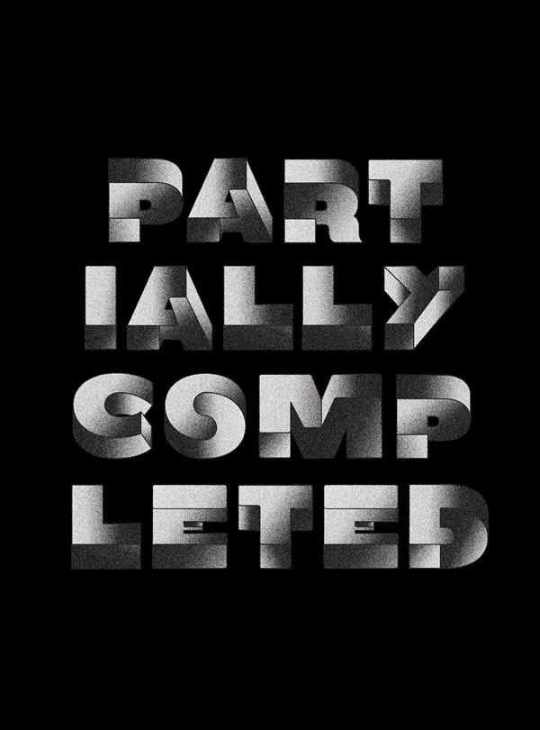
Even if you might not remember Escher‘s name, you have surely already seen some of his work. His endless stairs are one of the many examples where he tricks your eyes and makes you think that you are looking at impossible things.
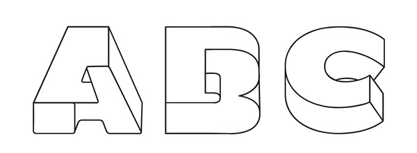
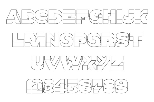
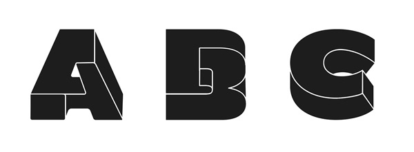
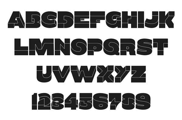
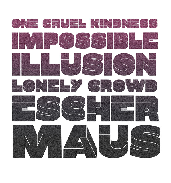
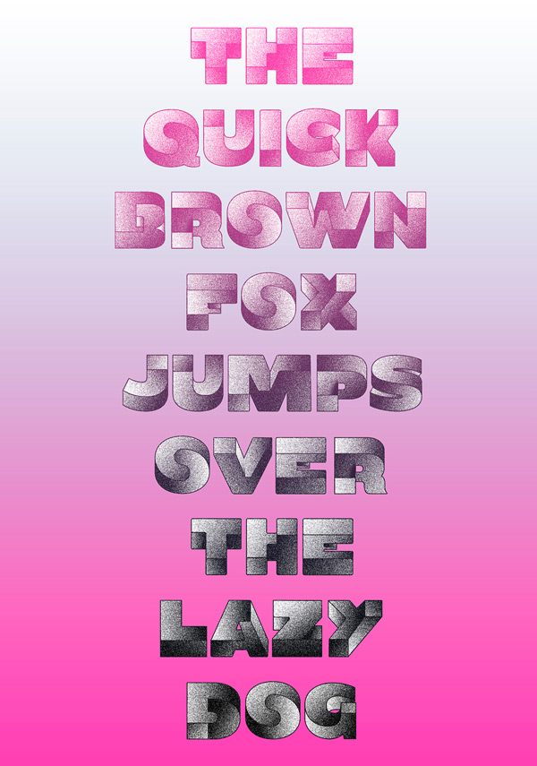
Inspired by the Dutch artist’s artworks, Birgit Palma created a twisted, experimental display font that looks impossible. Palma started working on some letters for a client, but she enjoyed it so much that she ended up creating an entire font.
The font name, Oxymora, comes from oxymoron, which is a figure of speech that is made of words that are opposed to each others. It has recently been published by Ultratypes, a type foundry based in Barcelona.
0 Comment "Oxymora: a font inspired by MC Escher’s work"
Post a Comment