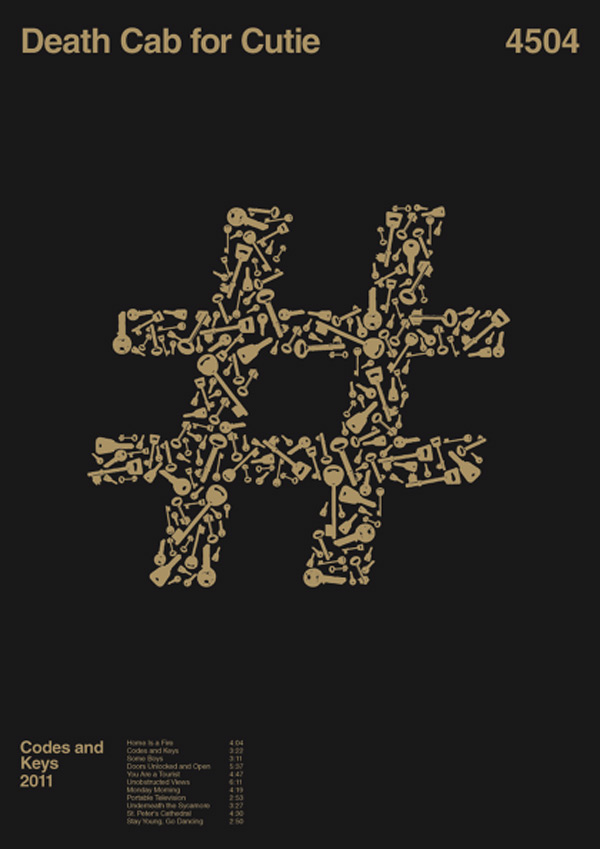
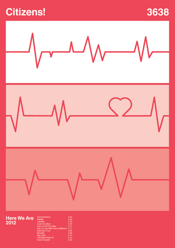
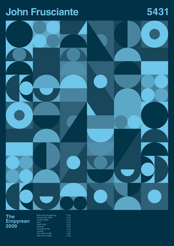
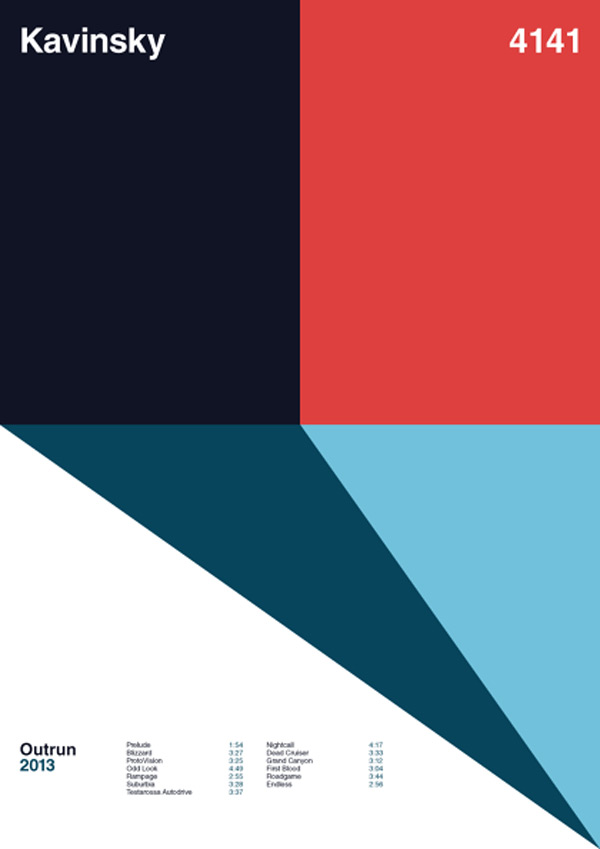
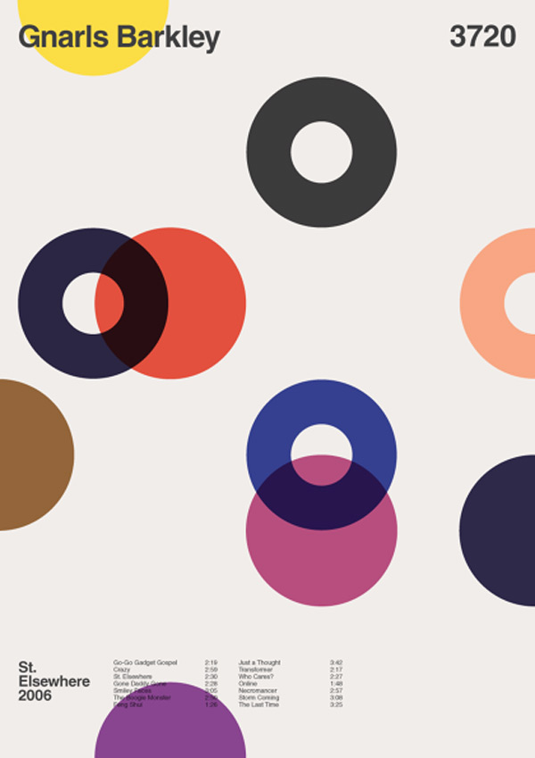
Album Anatomy is Duane Dalton’s side project, an exploration into minimalist graphic design. The designer did a great job of removing unnecessary information, he even went a bit too far on occasion.
The idea of these posters was inspired by the great “Bridging the gap" poster series. A strict grid is used to create the posters, a constraint that probably helps a lot in keeping the whole series coherent. The font used in the visuals is Helvetica, an obvious choice for grid-based minimalist designs. Dalton alredy created over 70 designs.
Unfortunately, the visuals cannot be acquired for copyright issues with the band names.


0 Comment "Album anatomy"
Post a Comment